Coming up with a logo that best represents your company is a crucial aspect of creating your signature brand identity. Some have been successful at having that memorable logos and some have failed. But what really constitutes a great logo? Of course, it has something to do with how memorable it can be, how easy it is to identify, and perhaps having a well-placed concept behind it as well.
Here are 10 brands that definitely hit the mark with their logos, and the hidden meanings that you may or may have not been aware of until now:
Amazon
Without a doubt, Amazon is one of, if not the most, well known and most visited online stores in the world. Their logo was designed by Anthony Biles from Turner Duckworth; and while this might seem a relatively simple and direct logo, you’d be amazed at what it actually stands for.
That orange arrow below conveys the idea that Amazon.com sells everything under the sun from A to Z. In addition to that, having to deal with tons of customers every single day, they also want to relay the message that these shoppers would definitely have a fantastic time buying from them with that smiley face as well.
![]()
Baskin-Robbins
It was way back in 1953 when Baskin-Robbins offered 31 different ice cream flavors, which was already considered as an innovation during that time. So what is it with the number 31? It’s just a simple concept of having one ice cream flavor for every day of the month.
Their original logo had the number 31 right in between the names Baskin and Robbins. But with their 60th anniversary in 2005, they revamped and updated their logo into a more modern-looking one. As you can see, they still managed to keep that special number, which is not easily recognizable if not for the fact that it’s colored in hot pink. And another addition is the number 12 (months of the year), which is situated on both sides of the number 31.
![]()
Carrefour
If you don’t know it yet, Carrefour is a multinational retail company based in France. “Carrefour” in English actually means crossroads, which also represents the wide range of merchandise that this supermarket chain offers.
Miles Newlyn is the person behind coming up with this logo, which actually displays two arrows pointing left and right that reflects the whole “crossroads” concept. More importantly, there’s also a negative space letter “c” placed in between the arrows and the use of the colors of the French flag from which this company was founded.
![]()
FedEx
FedEx’s logo–which was designed by Lindon Leader–is direct, clean, and very on point with what they want to convey. There’s not much hidden concept behind it save for the arrow that’s among the best examples of using negative space in a logo. It simply means the direction, speed, precision that represents the core values of the company.
![]()
Le Tour de France
Le Tour de France’s logo is a rather playful representation of this famous sporting event. It features a custom-made freehand font type, which actually has a hidden cyclist that’s shaped as the letter “R”, and the “U” and the yellow-orange circle serving as the bicycle. On a related note, the yellow-orange circle also serves as a symbol for the sun, connoting the summer season in which the event is being held.
![]()
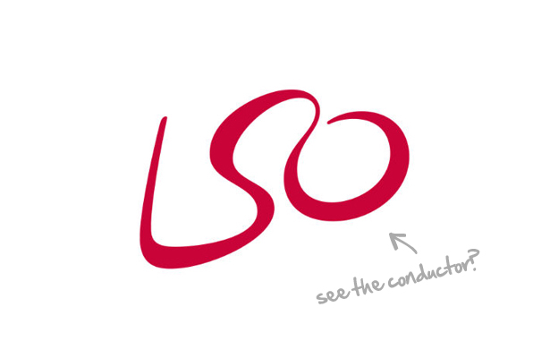
London Symphony Orchestra
The logo of the London Symphony Orchestra, which was designed by The Partners, is one of those abstract-type of logos that you just know holds a lot of hidden meaning that’s not as visible at first sight. You may just see the “LSO” acronym for the company, but it’s also a graphic illustration of a conductor holding a baton in his hand.
It might take some time… but you’ll get there for sure.
MyFonts
Underware, a studio based in Netherlands, is behind this very creative logo for MyFonts. It’s a custom-made font that strategically shows a hand on the “My” part, which basically represents how you’ll be getting your hands on their wide range of fonts.
![]()
Sun Microsystems
The Sun Microsystems’ logo is more of a technical one, which is very appropriate for this company that’s all about computers and innovative technology. It was designed by Vaughan Pratt, who also happens to be a computer guy, and shows an ambigram of the word “SUN” that’s spelled and can be read from four different angles.
![]()
Toblerone
Toblerone’s logo pays a homage to this world-famous Swiss chocolate’s origins. You may definitely not see at first, but it actually shows a hidden bear in the snow-covered mountain of the Matterhorn, which can be found in the border between Switzerland and Italy. And as for the bear, it represents the town of Bern, from which Toblerone was originally manufactured.
![]()
Vaio by Sony
The Sony Vaio logo, which was created by Timothy Hanley, is a visual treat for computer geeks. Oh and just for your information, VAIO is an acronym for Video Audio Intelligent Organizer. And while this explanation might not mean much for the “average” person, here it goes anyway: the left side is made out of a wave symbol, which represents the concept of analog technology; and the right side consists of the numbers “1” and “0”, which are the two digits used in binary code. So much geek language in there, right?
![]()
But more than just being a visual treat, what these logos succeeded at is telling a story–the story of their brand. So in your opinion, which of these brand logos capture a well-told story of the company it represents?
Credit: Ray Vellest/webdesignerdepot.com